Redesigning the Payments Experience for Barclays Mobile App
The payments feature is the most frequently used within the Barclays mobile app, with millions of credit card customers relying on it to make payments, track payment activity, and set up automatic payments. Barclays needed a native solution to improve the payments journey, ensuring that customers could fully rely on the app for their credit card transactions. I led the product design for this new native payments journey, focusing on creating a seamless, intuitive experience that met user needs and business goals.

Addressing the Limitations of a Hybrid Payments Solution
Barclays currently relies on a hybrid solution for the payments feature, which offers the benefit of using a single code language for both the website and mobile app. However, this approach also presents a significant drawback: when the website experiences downtime or crashes, the mobile app is affected as well. This means millions of customers could be unable to make payments, disrupting their experience and trust in the app’s reliability. Addressing this issue became a key focus in improving the payments journey.
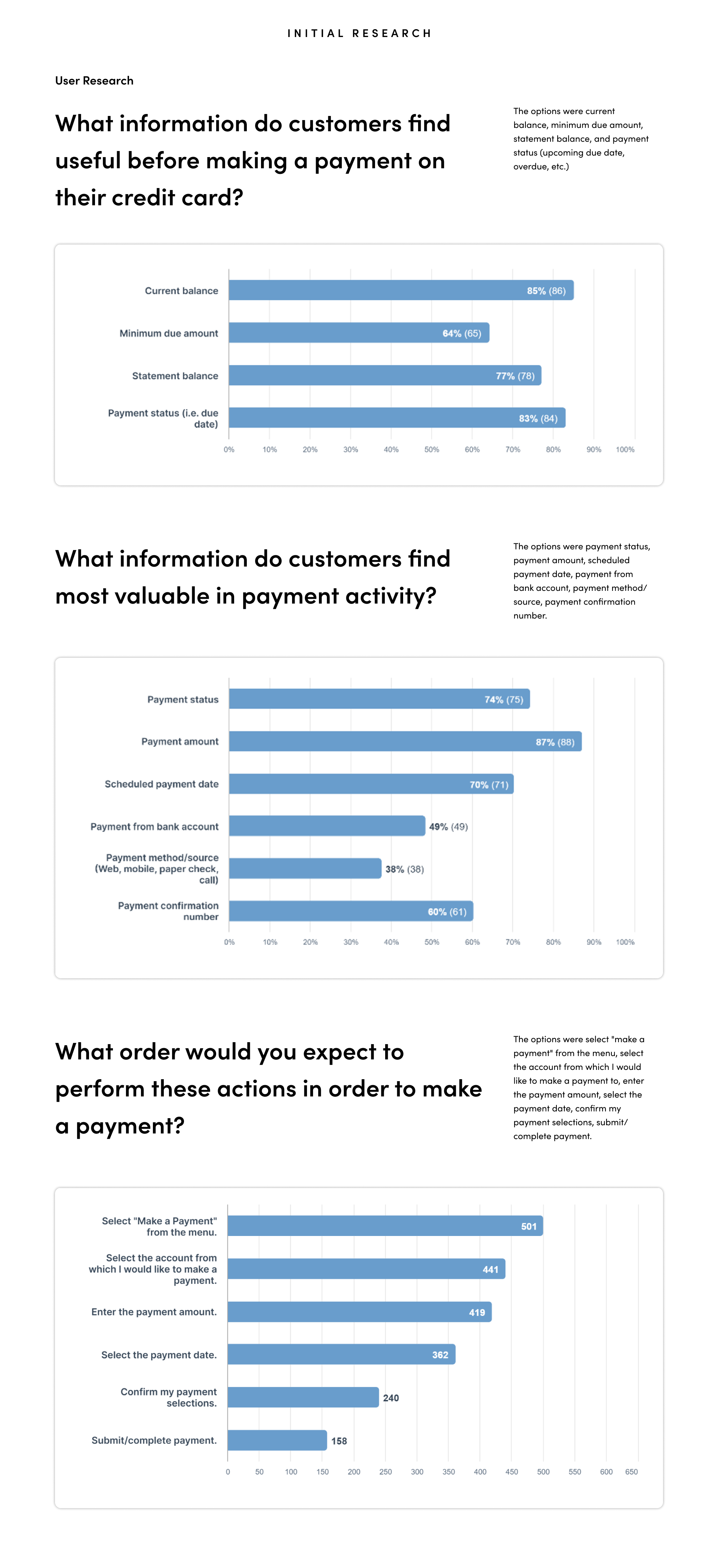
Initial Research through User Surveys
To kick off the project, I conducted an in-depth user survey to gather insights into customer pain points, needs, and expectations. The survey helped identify key areas where users were experiencing frustration and provided valuable data on how they interact with the payments feature. This research informed the direction of the design and helped ensure that the solution would directly address the most pressing issues for users.
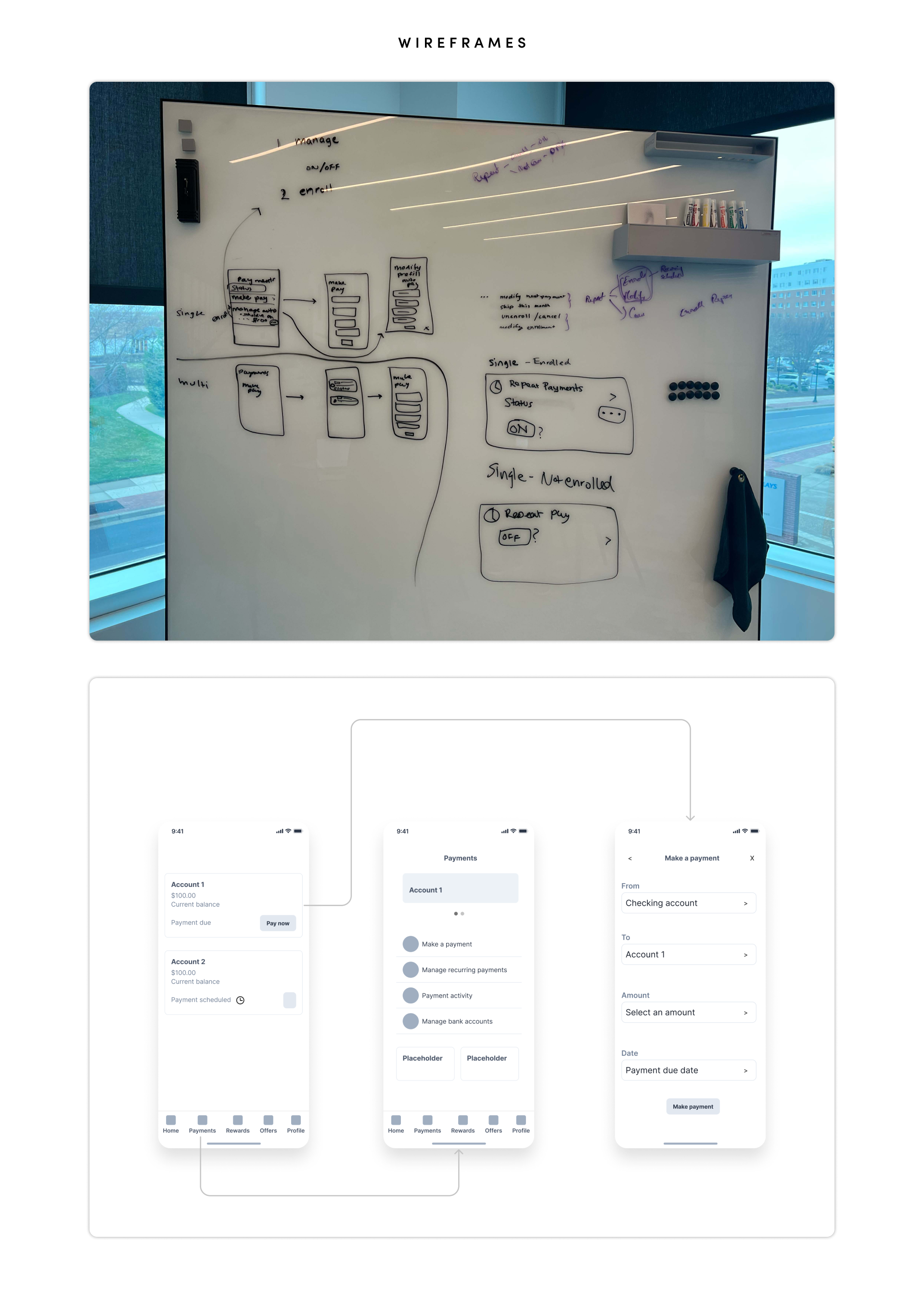
Wireframing the Payment Journey
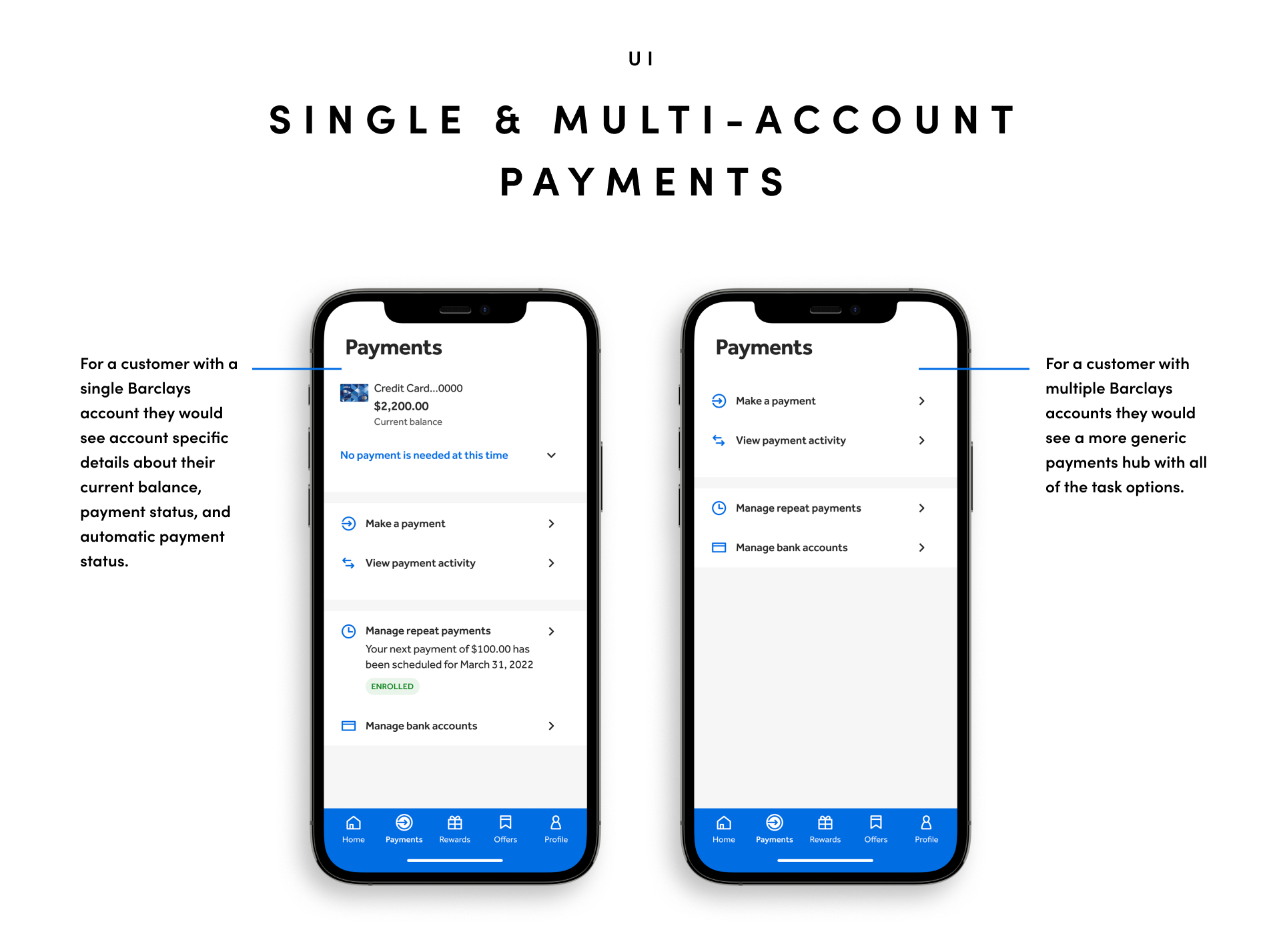
Using insights from the user research, I began wireframing the payment journey for both single and multi-account users. The goal was to design an intuitive, efficient flow that addressed the unique needs of each user type, ensuring a seamless and reliable experience across different payment scenarios.
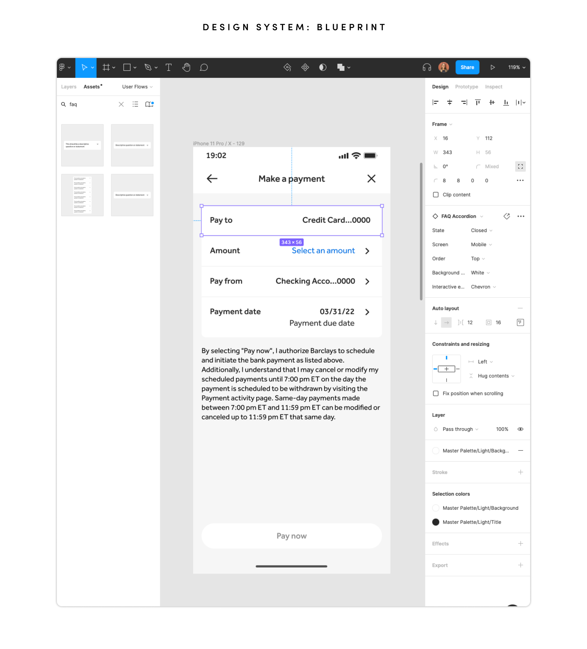
Designing High-Fidelity Wireframes with Blueprint Design System
Once the wireframes were approved by stakeholders and product owners, I moved forward with designing high-fidelity wireframes using Blueprint, Barclays' design system and component library. Blueprint enables faster, more consistent digital services by providing pre-built components that are designed with usability and accessibility at their core.
I had the opportunity to contribute to the New Component workstream while Blueprint was being developed, using tools like Storybook and Figma to host components and code (CSS, React, Angular). The library assets were integral in shaping the payments experience, ensuring a cohesive and accessible design throughout the project.
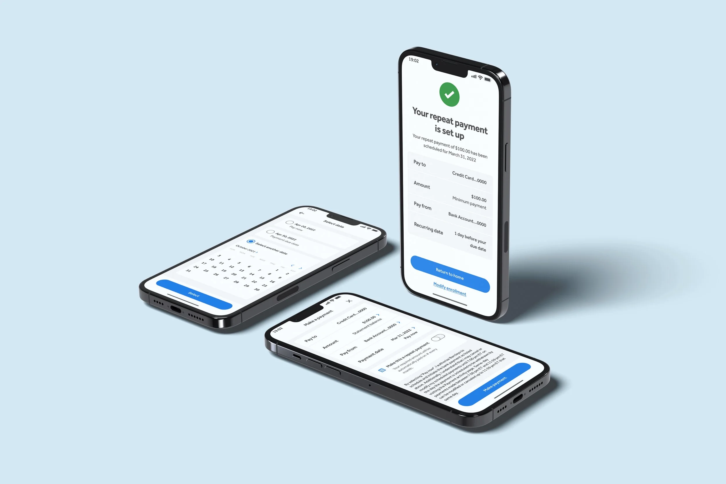
Finalizing the User Interface Design
After completing the high-fidelity wireframes, we shifted our focus to refining the final user interface design. This phase involved adding color schemes, typography, icons, and other visual elements to enhance the user experience. We also focused on button styles, spacing, and layout consistency to ensure a polished and cohesive look across the design.
The goal was to create a visually engaging and intuitive interface that aligned with the brand’s identity. This stage acted as the bridge between the wireframes and the development phase, providing the team with a clear, detailed design to bring to life.
Conclusion
The redesign of the payments journey was guided by user research, iterative design, and close collaboration with stakeholders. By incorporating user feedback, leveraging Blueprint components, and focusing on usability and accessibility, we created an intuitive and visually engaging interface that addressed key user pain points.
The final design serves as a solid foundation for the development team to implement, ensuring a seamless experience for Barclays’ customers.

